
How did the Poster come to be?
The idea for my poster came to life as I started thinking about the emotional core of my project. I knew I wanted something that wasn’t just visually striking, but also deeply connected to the story. I reflected on the themes of the film—friendship, loss, reconciliation—and I asked myself what image could capture all of that in a single moment. That’s when I thought about the pinky promise, which became the perfect visual metaphor. From there, I began envisioning color palettes, typography, and imagery that could represent both the warmth and heartbreak within the story. The concept evolved organically from there, driven by the desire to create something that would resonate emotionally with the audience even before they saw the film.
Initial Photos
What went wrong?
The initial photos didn’t turn out the way I had hoped. While the concept was solid, there were a few issues that made the images fall flat. First, the lighting wasn’t ideal — it was either too harsh or too dim, which affected the overall mood and clarity of the shots. The background also ended up being too distracting, taking attention away from the subjects and the emotional focus of the pinky promise. On top of that, some of the poses felt a bit too staged or awkward, which made the connection between the characters feel less authentic. Overall, the photos didn’t quite capture the tone or intimacy I was aiming for, so I knew I needed to try again with a more intentional setup and clearer direction.
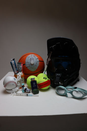
New Poster Photos


